Colour Theory
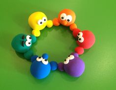
This week explored the importance of the application of colour in website design.
Consistency of colour throughout a piece of work is called a colour scheme, and used effectively it can help communicate a message.
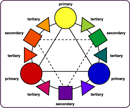
The Colour Wheel
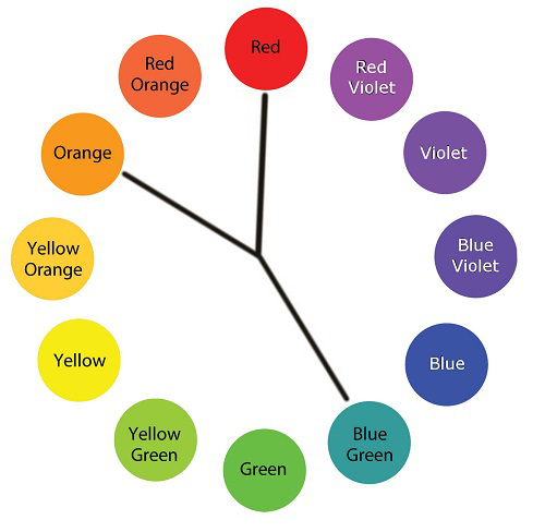
The Colour Wheel is used to show the relationship between the 12 colours. There are 3 Primary Colours, 3 Secondary Colours and 6 Tertiary Colours.
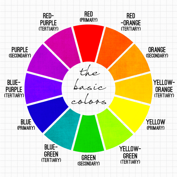
The Colour Wheel
The Primary Colours
The 3 Primary Colours – Red, Yellow and Blue – form the basis of Colour Theory. None of these colours can be made by the mixing of other colours.
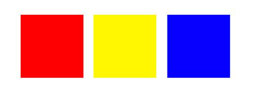
Primary Colours
The Secondary Colours
The 3 Secondary Colours are orange, green and violet. Any of these can be made by mixing two Primary Colours.
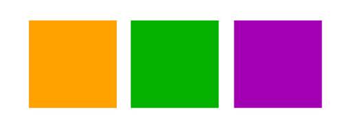
Secondary Colours
Tertiary Colours
The 6 Tertiary Colours (+3 Primary + 3 Secondary) compete the 12-Colour Wheel. Tertiary Colours are made by mixing one Primary Colour with an equal, part adjacent secondary colour.
They are: YELLOW-ORANGE, RED-ORANGE, RED-VIOLET, BLUE-VIOLET, BLUE-GREEN and YELLOW-GREEN.
How Tertiary Colours Fit into the Colour Wheel
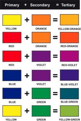
How Tertiary Colours are Created
Tints, Tones & Shades
A HUE is a pure colour – one of the 12 on the Colour Wheel.
A TINT is a hue blended with WHITE
A TONE is a hue blended with GREY
A SHADE is a hue blended with BLACK
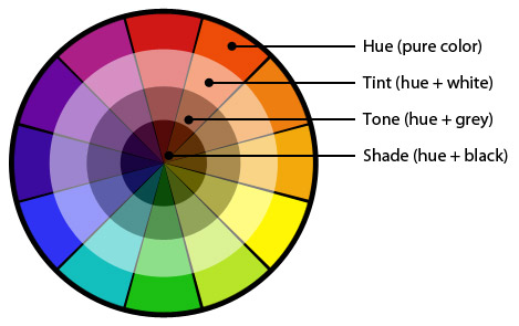
Tints, Tones & Shades
What About Black and White?
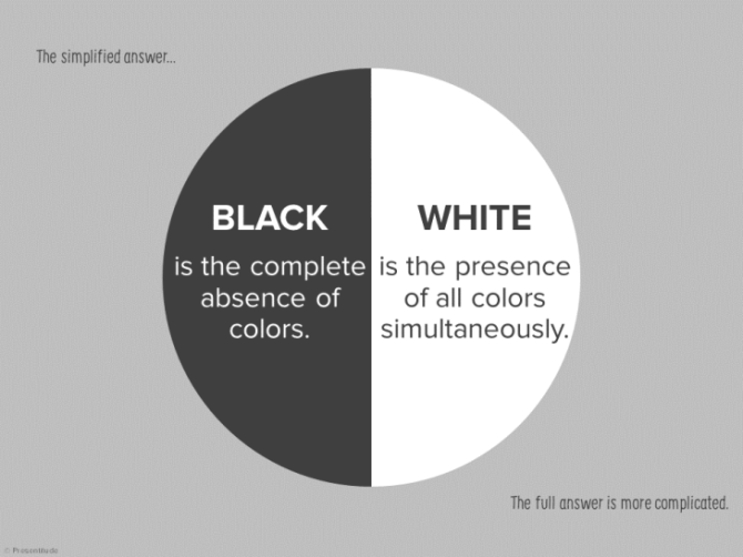
This Speaks for Itself!
One More Thing..
How is the Colour Brown Made?
Brown is a composite colour, and is created by mixing RED, BLACK and YELLOW.
Colour Combinations
If colours are put together skilfully, the result can set a mood, draw attention or make a statement – colours can actually affect how a person feels emotionally. Thus it is a crucial tool in design, and needs to be utilised effectively.
When the 12 colours in the Colour Wheel are combined, it creates a ‘colour scheme’, and there are some tried and tested colour combinations which work particularly well – these are called ‘colour harmonies’: two or more colours with a fixed relation in the Colour Wheel.

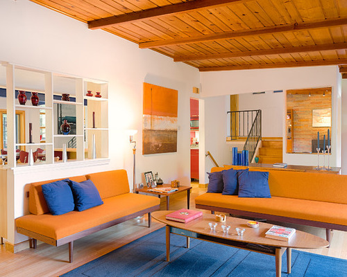
An Example of a Warm Colour Scheme – based around REDS, ORANGES and YELLOWS (also known as advancing colours)
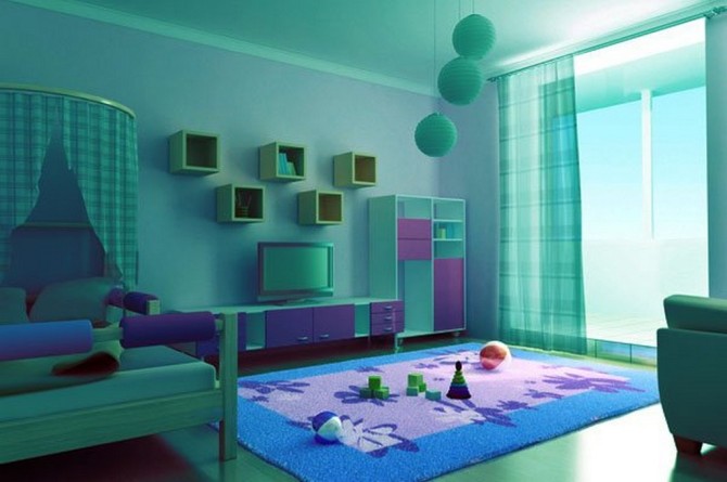
An Example of a Cool Colour Scheme – based arounds GREENS, BLUES and VIOLETS – also known as receding colours
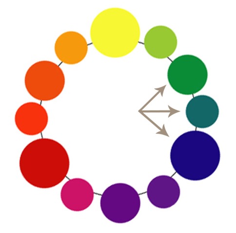
Complimentary Colours
Complimentary colours are opposite each other on the Colour Wheel – when mixed they make GREY. When using complimentary colours in a colour scheme, the stark contrast between the two can be striking…but needs to be used carefully so as not to be garish!
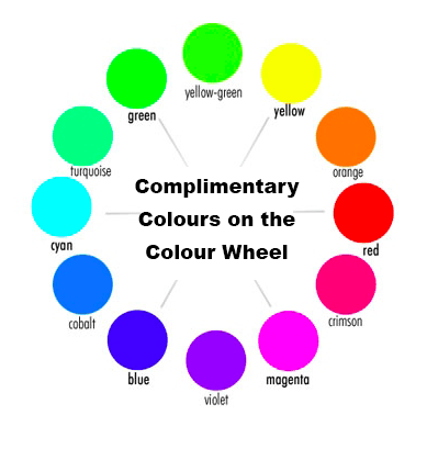
How Complimentary Colours are Made
An Example of a Colour Scheme using Complimentary Colours
Split Complimentary Colours
A split-complimentary colour scheme is an expansion of the complimentary colour scheme. It uses ONE BASE COLOUR plus TWO ADJACENT COLOURS – this retains the contrasting nature of a complimentary colour scheme, but is more balanced and gentler on the eye.
How Split-Complimentary Colours are Combined
An Example of a Split-Complimentary Colour Scheme
Triadic Colours
A triadic (triangle) colour scheme uses three colours which are equally spaced around the Colour Wheel. It has the benefits of vibrancy and strong visual contrast but keeping a sense of balance. It works best when one colour is dominant and the other two are used as accents.

How Triadic Colours work in the Colour Wheel (make a triangle shape)

An example of a Triadic Colour Scheme
Tetradic Colours
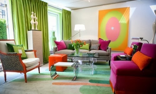
A tetradic (rectangular) colour scheme combines four colours in the Colour Wheel, which are arranged in two complimentary colour pairs. This gives a good deal of scope for variation. However if all four colours are used in equal amounts the scheme could look unbalanced and chaotic.
Bearing this in mind, it is important to be aware of colour temperature when using a tetradic colour scheme. Two warm colours and two cool colours used in equal amounts help to bring balance and harmony.

Tetradic Colours in the Colour Wheel (make a rectangle shape)

An example of a Triadic Colour Scheme
Analogous Colours
Analogous colours sit next to each other on the Colour Wheel and share an undertone of the same colour (rather than mixing warm and cool colours which can look unbalanced) Using an analogous colour scheme offers a harmonious, calming and interesting effect.
Analogous Colours sit next to each other on the Colour Wheel

An example of a warm-colouredAnalogous colour scheme – using yellow, yellow-orange and orange
Monochromatic Colours
Monochromatic colours colours are made up of different saturations (tints, tones and shades) of the same colour.
The benefits of using a monochromatic colour scheme are that it is calming and brings a sense of serenity. It is consistently balanced and visually attractive. However, it can lack contrast (clearly!) and vibrancy.


An example of a Monochromatic colour scheme
Types of Colour Theories
Additive Colour Theory
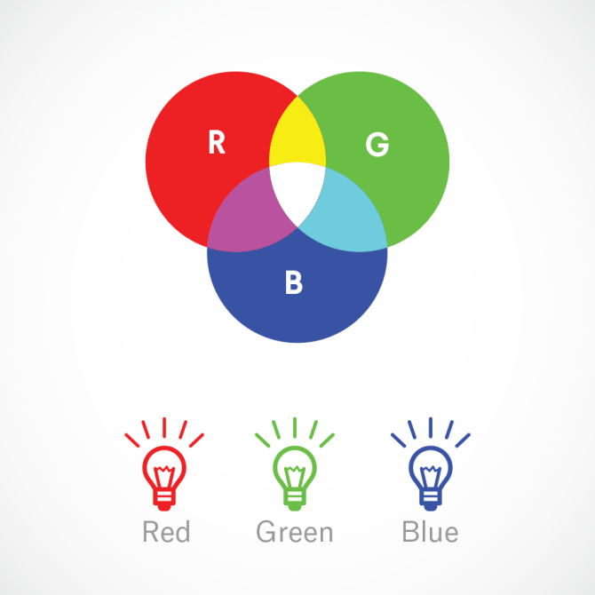
Additive Colour Theory (RGB)
Simply put, this is about mixing two or more hues together to create a third.
The Primary Colours in Additive Theory are RED, GREEN and BLUE (RGB) – added together these make WHITE
It is also known as LIGHT THEORY, as it deals with radiated and filtered light. BLACK radiates NO LIGHT. WHITE radiates ALL LIGHT. The more light that is added, the brighter the colour mix becomes.
Because VIDEO is the process of capturing and RADIATING light, it uses Additive (LIGHT) Theory . This is used in TV, theatre lighting, computer monitors and video production. If an incorrect choice of colour process (ie not RGB) is made by someone when designing for a website, for example, then a bright red logo risks appearing muddy when it is on screen.
Subtractive Colour Theory
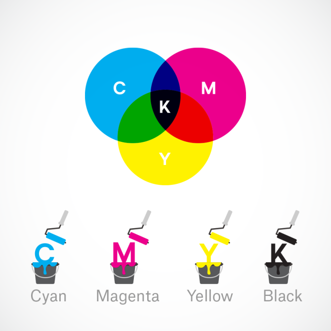
Subtractive Colour Theory (CMYK)
This is more complex! It deals with how WHITE LIGHT is absorbed and reflected off coloured surfaces. It is also known as PIGMENT THEORY.
It is subtractive because light is subtracted by adding more colour (pigment).
The Primary Colours in Subtractive Theory are CYAN, YELLOW, MAGENTA and BLACK (CYMK)
Subtractive Colour Theory is most often used in printing and painting – colour that is seen on a physical surface. The CYMK colour combination allows printers to produce a wider variety of colours on paper than RBG.
THE TASK
The task was to rework my holiday website using 3 different colour schemes.

The Original

A Warm Colour Scheme – Reds, Yellows and Oranges

A Split-Complementary Colour-Scheme – Pink, Purple and Yellow

An Analogous Colour Scheme – Yellow-Green, Green and Blue-Green
Reflection
Out of all of the colour-schemes, my ‘cool’ original version remains my favourite. The blues and the white are clean and crisp and feel fitting for a skiiing holiday website.
However I do like all of the variations! Each one looks good, and the tweaking of the colours show that Colour Theory really does work. It enables different sets of colours to be combined in ways which produce great results.
